
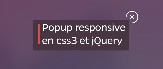
Nous allons voir dans ce tuto comment faire apparaître un formulaire d’inscription (ou toute autre information) dans une popup responsive et ce en CSS3 et jQuery.
Je vous laisse découvrir la démo et télécharger les fichiers sources de ce tutoriel.
On va donc voir comment ajouter une classe en jQuery sur une div qui va permettre d’afficher une popup en CSS3. Une popup peut être très pratique pour afficher une information sur toutes les pages mais avec un gain de place énorme du fait qu’elle n’est affichée qu’au clic.
Le code HTML :
<!DOCTYPE html>
<html lang="fr" class="no-js">
	<head>
		<meta charset="UTF-8" />
		<meta http-equiv="X-UA-Compatible" content="IE=edge,chrome=1">
		<meta name="viewport" content="width=device-width, initial-scale=1.0">
		<title>Popup d'inscription</title>
		<meta name="description" content="Popup en CSS3 et JS pour le blog webdesignweb.fr" />
		<meta name="keywords" content="modal, window, overlay, modern, box, css transition, css animation " />
		<meta name="author" content="Stratis BAKAS" />
		<link rel="shortcut icon" href="../favicon.ico">
		<link rel="stylesheet" type="text/css" href="css/style.css" />
		<script src="js/modernizr.custom.js"></script>
		<script src="http://code.jquery.com/jquery-1.11.1.min.js"></script>
		<link href='http://fonts.googleapis.com/css?family=Lato:100,300,400,700,900,100italic,300italic,400italic,700italic,900italic|Montserrat:400,700' rel='stylesheet' type='text/css'>
	</head>
	<body>

		<!-- LE CONTENU DE LA POPUP -->

		<div class="modal blur-effect" id="popup">
			<div class="popup-content">
				<h3>Inscription News</h3>
				<div>
					<p class="para">Lorem ipsum dolor sit amet, consectetur adipisicing elit, sed do eiusmod tempor incididunt ut labore et dolore magna aliqua.</p>
					<input type="text" placeholder="Adresse email" />
					<input type="submit" class="submit" value="je m'inscris" />

					<div class="close"></div>
				</div>
			</div>
		</div>

		<!-- FIN DE LA POPUP -->

		<!-- CONTENU DE LA PAGE -->

		<div class="container">

			<div class="content">

				<a href="#" class="logo"><img src="img/logo.png"></a>

				<h1>A propos de la newsletter</h1>
				<p class="intro">Lorem ipsum dolor sit amet, consectetur adipisicing elit, sed do eiusmod tempor incididunt ut labore et dolore magna aliqua. Ut enim ad minim veniam, quis nostrud exercitation ullamco laboris nisi ut aliquip ex ea commodo consequat.</p>

				<button class="popup-button" data-modal="popup">Je m'inscris !</button>

				<img src="img/mac.jpg" alt="yosemite webdesignweb">

			</div><!-- .content -->

		</div><!-- .container -->

		<!-- FIN DU COTENU DE LA PAGE -->

		<div class="overlay"></div><!-- La div overlay -->

		<!-- Le script qui crée la popup -->
		<script src="js/popup.js"></script>

		<!-- Pour l'effet blur -->
		<!-- by @derSchepp https://github.com/Schepp/CSS-Filters-Polyfill -->
		<script>
			// this is important for IEs
			var polyfilter_scriptpath = '/js/';
		</script>
		<script src="js/cssParser.js"></script>
		<script src="js/css-filters-polyfill.js"></script>
	</body>
</html>
Le code CSS :
*, *:after, *:before { -webkit-box-sizing: border-box; -moz-box-sizing: border-box; box-sizing: border-box; }
body, html { font-size: 100%; padding: 0; margin: 0; }
.clearfix:before, .clearfix:after { content: " "; display: table; }
.clearfix:after { clear: both; }

body {
	font-family: 'Lato', Calibri, Arial, sans-serif;
	color: #005C97;
	background: #5a2c4d url(../img/blur.jpg) no-repeat center top;
	-webkit-background-size: cover;
	-moz-background-size: cover;
	-o-background-size: cover;
	background-size: cover;
}

input {
	-webkit-border-radius: 2px;
	-moz-border-radius: 2px;
	border-radius: 2px;
	padding: 25px;
	display: block;
	margin: 0 auto 50px;
	width: 75%;
	border:none;
	font-family: 'Lato', sans-serif;
	font-size: 18px;
	color: #73556b;
}

button {
	border: 3px solid #FFF;
	padding: 0.6em 1.2em;
	background: transparent;
	color: #FFF;
	font-family: 'Lato', Calibri, Arial, sans-serif;
	font-size: 1em;
	letter-spacing: 1px;
	text-transform: uppercase;
	cursor: pointer;
	display: inline-block;
	margin: 3px 2px;
	border-radius: 2px;
	-webkit-transition: all 0.3s;
	-o-transition: all 0.3s;
	transition: all 0.3s;
}

button:hover {
	background: #FFF;
	color: #f65283;
}

a.logo {
	display: block;
	width: 182px;
	margin: 0 auto;
}

h1 {
	font-family: 'Montserrat', sans-serif;
	color: white;
	font-weight: normal;
	font-size: 60px;
}

p.intro {
	font-family: 'Lato', sans-serif;
	color:#f65283;
	font-weight: 300;
	font-style: italic;
	font-size: 23px;
	margin: 0 auto 50px;
}

.container {
	background: url(../img/blur.jpg) no-repeat center top;
	-webkit-background-size: cover;
	-moz-background-size: cover;
	-o-background-size: cover;
	background-size: cover;
	min-height: 1440px;
	text-align: center;
	padding: 5%;
}

.content {
	max-width: 1300px;
	width: 80%;
	margin: 0 auto;
}

.popup-button {
	margin-bottom: 60px;
}

img {
	max-width: 100%;
}

.modal {
	position: fixed;
	top: 50%;
	left: 50%;
	width: 50%;
	max-width: 630px;
	min-width: 320px;
	height: auto;
	z-index: 2000;
	visibility: hidden;
	background: #473542;
	-webkit-backface-visibility: hidden;
	-moz-backface-visibility: hidden;
	backface-visibility: hidden;
	-webkit-transform: translateX(-50%) translateY(-50%);
	-moz-transform: translateX(-50%) translateY(-50%);
	-ms-transform: translateX(-50%) translateY(-50%);
	transform: translateX(-50%) translateY(-50%);
}

.show {
	visibility: visible;
}

.overlay {
	position: fixed;
	width: 100%;
	height: 100%;
	visibility: hidden;
	top: 0;
	left: 0;
	z-index: 1000;
	opacity: 0;
	-webkit-transition: all 0.3s;
	-moz-transition: all 0.3s;
	transition: all 0.3s;
}

.show ~ .overlay {
	opacity: 1;
	visibility: visible;
}

.popup-content {
	color: #fff;
	position: relative;
	border-radius: 3px;
	margin: 0 auto;
	padding: 6% 10%;
}

.popup-content h3 {
	margin: 0;
	text-align: center;
	font-size: 3.4em;
	font-weight: 300;
	position: relative;
}

.popup-content h3:before {
	position: absolute;
	background: url(../img/img-titre.png) no-repeat left center;
	width: 47px;
	height: 38px;
	content: "";
	top: 18px;
	left: 0px;
}

.popup-content .para {
	color: #73556b;
	margin-bottom: 30px;
	text-align: justify;
}

.popup-content > div {
	padding: 0px;
	margin: 0;
	font-weight: 300;
	font-size: 1.15em;
}

.popup-content > div p {
	margin: 0;
	padding: 10px 0;
}

.popup-content > div ul {
	margin: 0;
	padding: 0 0 30px 20px;
}

.popup-content > div ul li {
	padding: 5px 0;
}

.popup-content button {
	display: block;
	margin: 0 auto;
	font-size: 0.8em;
}

.close {
	background: url(../img/close.png) no-repeat;
	height: 49px;
	width: 49px;
	position: absolute;
	right: -35px;
	top: -35px;
	z-index: 9999;
	cursor: pointer;
	opacity: 1;
	-webkit-transition: all ease-in-out 0.3s;
	-o-transition: all ease-in-out 0.3s;
	transition: all ease-in-out 0.3s;
}

.close:hover {
	opacity: 0.2;
}

.submit {
	background: #e74c3c url(../img/heart.png) no-repeat 90% center;
	color: white;
	font-family: 'Lato', sans-serif;
	font-size: 18px;
	opacity: 1;
	cursor: pointer;
	-webkit-transition: all ease-in-out 0.3s;
	-o-transition: all ease-in-out 0.3s;
	transition: all ease-in-out 0.3s;
}

.submit:hover {
	opacity: 0.5;
}


/* Effet blur */
.show.blur-effect ~ .overlay {
	background: rgba(123,53,92,0.4);
}

.show.blur-effect ~ .container, .show.blur-effect ~ .bgall{
	-webkit-filter: blur(30px);
	-moz-filter: blur(30px);
	filter: blur(30px);
}

.blur-effect .popup-content {
	-webkit-transform: translateY(-5%);
	-moz-transform: translateY(-5%);
	-ms-transform: translateY(-5%);
	transform: translateY(-5%);
	opacity: 0;
}

.show.blur-effect ~ .container,
.blur-effect .popup-content, .show.blur-effect ~ .bgall {
	-webkit-transition: all 0.3s;
	-moz-transition: all 0.3s;
	transition: all 0.3s;
}

.show.blur-effect .popup-content {
	-webkit-transform: translateY(0);
	-moz-transform: translateY(0);
	-ms-transform: translateY(0);
	transform: translateY(0);
	opacity: 1;
}

/* Media queries */

@media(max-width: 1230px) {

	.popup-content h3:before {
		display: none;
	}

}

@media(max-width: 680px) {

	h1 {
		font-size: 42px;
	}

}

@media(max-width: 480px) {

	h1 {
		font-size: 32px;
	}

	.popup-content h3 {
		font-size: 2em;
	}

	.close {
		right: 1px;
		top: 1px;
	}

}
Le code JS :
/**
 ** POPUP by Stratis BAKAS
 */

var popup = (function()
{

	function init() {

		var overlay = $('.overlay');

		$('.popup-button').each(function(i, el)
		{
			var modal = $('#' + $(el).attr('data-modal'));
			var close = $('.close');

			// fonction qui enleve la class .show de la popup et la fait disparaitre
			function removeModal() {
				modal.removeClass('show');
			}

			// evenement qui appelle la fonction removeModal()
			function removeModalHandler() {
				removeModal();
			}

			// au clic sur le bouton on ajoute la class .show a la div de la popup qui permet au CSS3 de prendre le relai
			$(el).click(function()
			{
				modal.addClass('show');
				overlay.unbind("click");
				// on ajoute sur l'overlay la fonction qui permet de fermer la popup
				overlay.bind("click", removeModalHandler);
			});

			// en cliquant sur le bouton close on ferme tout et on arrête les fonctions
			close.click(function(event)
			{
				event.stopPropagation();
				removeModalHandler();
			});

		});
	}

	init();

})();
J’espère que cet article vous a plu. N’hésitez pas à partager et à commenter.